 |
Version 2.9.3
|
|
Version 2.9.3
|
The WiredTiger distribution includes the wtstats tool that can be used to examine information generated using statistics logging (see Statistics logging) and wtperf monitoring output (see Simulating workloads with wtperf).
After running an application with statistics logging configured, the statistics output files will be in the database home directory. By default they are the files named with a WiredTigerStat prefix and a day and hour timestamp.
To create an HTML file with a graphical representation of the statistics run the following command, replacing wiredtiger with the path to the WiredTiger build directory, and replacing database-directory with the application's database home directory:
If not all of the statistics files are being processed, a subset can be specified to the tool. For example:
In either case, a wtstats.html file will be generated in the current directory that you can open in your browser.
Additional options are available, use wtstats.py –help to display them.
The following is an example wtstats.html display:
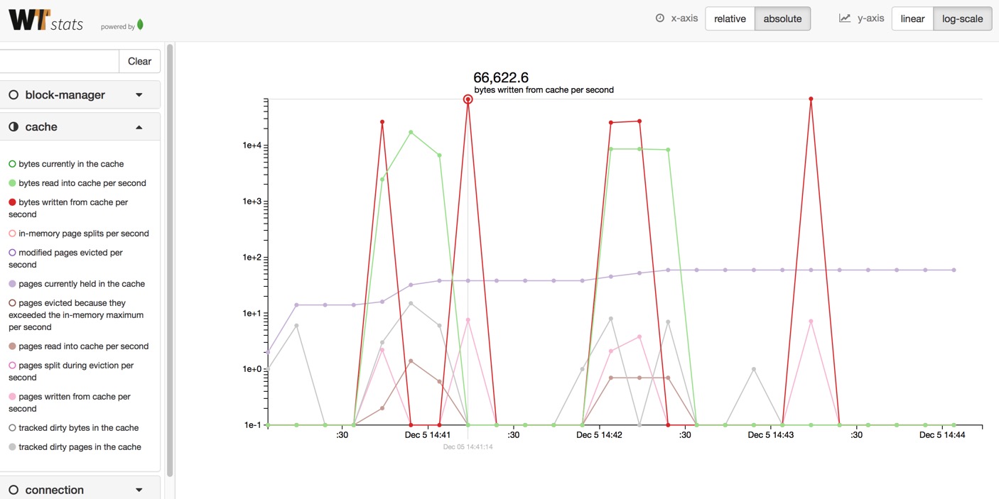
When you open the generated HTML file, you will see an empty page with some basic instructions in the middle, a sidebar containing grouped sections on the left, and buttons to toggle axis settings at the top right.
To look at specific statistics, open the respective section by clicking on the section heading or the little arrow on the right. For example, click on the word "connection" in the sidebar to reveal the connection stats. Inside a group, click on any of the contained stats to toggle them on or off. You should see the stats graph appear in the main window. To toggle the entire group on or off, you can click on the circle next to the group heading. To look at one specific isolated statistic, you can shift-click on the stat. This will disable all but the chosen stat. Shift-clicking it again will return to the previous selection.
Depending on your WiredTiger settings, you may have gathered a large number of stats. Use the search bar above the stats groups to filter stats on keywords. For example, typing mem into the search bar will show all stats that have the substring "mem" in them. Press the "Clear" button to clear the filter again.
Once some stats are showing in the main view panel, use the mouse to hover over the graphs. A cross-hair will appear highlighting the data point closest to the mouse cursor and showing the stat name and value (y-axis). A small gray label below the x-axis will additionally show the exact x-axis value for the current data point.
You can zoom into the graph via various mouse/trackpad gestures (some of which may not be supported by your input device):
If you zoom into a dataset far enough to see individual data points, they will be displayed as little circles along the graph line.
You can pan the graphs left/right by click-dragging the area horizontally.
If your data contains a lot of sample points (more than pixels available in the current window), wtstats will sub-sample your data for efficiency reasons. When this happens, a yellow warning box will appear at the top next to the buttons. Due to sub-sampling, narrow spikes in a graph may not always be visible and you may experience some jitter when panning the data left/right. To ensure that all data points are rendered, widen your browser window or zoom into the data until the sub-sampling warning disappears.
The wtstats display lets you switch modes for both the x- and y-axis with the buttons at the top right.
The x-axis button switches between relative and absolute time, with the default being relative time.
In "relative time" mode, every individual stat is assumed to start at time 0, and the x-axis displays the duration in seconds that have passed since the start. A useful use case for relative mode is when you record multiple stat files of the same data workload in succession, and want to compare them against each other. Relative mode will show the stat files overlapping, despite them being recorded at different times.
Absolute time plots the stats at their exact recording times. The x-axis shows date and time of the events. If stat files are recorded at different times, they appear in the graph at different intervals on the x-axis. This mode is most useful to correlate events in wtstats with other data sources, for example system profiling or monitoring data, based on their timestamp.
The y-axis button toggles between linear and logarithmic scaling mode, the default is linear. Linear mode is most useful if the visible stats have similar value ranges. However, if you compare stats of different magnitudes, for example "bytes in cache" vs. "files open", you can switch to "log-scale" mode to avoid having one graph dominate the entire range. The same is true for outliers in a single graph: if the outlier dominates the range, switch to log mode for better scaling.